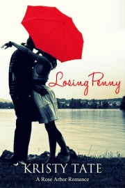
This is what the judge had to say about Losing Penny's cover. (It's a finalist in a contest The judge must be British or Australian, so it's much more fun if you read his critique with an accent. I love his double use of exclamation points--something that apparently artists, but not writers, can do.)
Don’t you just love the colours in this lovely contemporary romance design? The red umbrella matches the title and attracts attention. The light red combines well with the dark navy blue…reminds me of how in design school they used to teach that one should vary tones in a composition – combine light tones with darker ones of an opposite colour…There is a lot of space in the cover too which is really nice as the background does not look overcrowded and it makes the image stand out more. The setting is appropriate for the book as a large part of the story takes place at the seaside. A really stunning cover!!
://ebookindiecovers.com/monthly-indie-ebook-cover-awards/february-2013-indie-ebook-cover-awards/


No comments:
Post a Comment